
I designed and prototyped a mobile app that lets people explore Benguiat’s personality by typing, changing weight, testing words, with a look and feel shaped by a creative brief.
Role: Product Designer
Team: Me
Timeline: 3 Weeks
Tools Used: Figma, Google Fonts, Prototyping, Visual Design
The problem
How can I support users to decide a font through an immersive experience?
A type specimen poster is a class exercise in design programs, but for this project my teacher mixed it up a bit for some more challenge.
Who it's for
My instructor provided us with a short creative brief: choose a typeface and a few buzzwords describing its personality. There was no user research behind it, so I treated the words as an audience. Someone who was confident, peculiar, bold but elegant. I used those buzzwords to help guide my design choices for the initial color palette. Elegance shaped the gold color of the font, confidence shaped the shape and layout of the keyboard and peculiar helped shape the structure of the typeface display on the grid.

Insights
The serifs shaped the layout. Throughout the design process I noticed that Benguiat had fine delicate serifs at the ends of the stroke. To highlight these intricacies and reflect the keywords in the brief I placed each letter on a grid. This rigid structure contrasts with the delicate curves, which helps show off the elegance of the letterform.
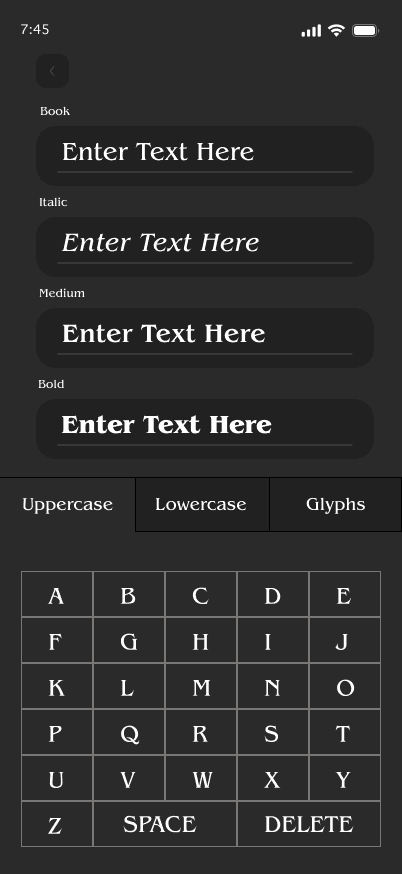
The keyword “peculiar” shaped the keyboard. A standard iOS or Android keyboard did not match the visual identity of the rest of the app so, I designed my own from scratch. The keyword “peculiar” made me think of looking through files to learn more. That led me to a tabbed structure, so exploration of the font feels like filing through a folder.
Ideation
Using the keywords and brief given, I started with sketch exercises to ensure I was taking into consideration the constraints of the product requirements.
The app had to:
Switch between different weights
Type into the keyboard words and phrases
Adjust their choices with a backspace or undo
Some questions that I had to consider:
Letter and Glyph Organization: How will the user select one letter? Or a glyph?
Visual Prioritization: Where will the letter be presented?
Interactivity: How will the user type a full sentence?
With these requirements in mind, I came up with several solutions to solve the problem of organization.

Secondary Screen for Interactivity: Putting both the individual letter or glyph and the sentence on one page with the keyboard was difficult to encapsulate effectively on one screen without one taking importance over the other. Through my initial sketches I expected that users who have explored their initial thoughts about the letter through individualized view would be inclined to explore more by choosing to enter custom text through a separate button.
Tabbed Organization for Letters and Glyphs: From experience I knew that displaying all of the letters at once or through a list would be overwhelming for a user to navigate efficiently. Taking inspiration from component libraries of keyboards, I quickly recognized that the keyboard did not match the visual identity of the rest of the app. Sketching out ideas provided an idea, that a tabbed organization structure felt that I was searching or exploring information.
Given these potential solutions I took my sketches to Figma to start drafting and visualizing them in action. Through further refined exploration in Figma, this confirmed a multipage design - as there was not enough space on a mobile screen to use a keyboard easily (accessibility is key here!). Through design components, I explored radio buttons to help support changing of typeface weight.

Key Decisions
Multiple Screens: With the concept of multiple screens instead of one, I explored how I could visually display information across screens effectively without them feeling disconnected. This led me to choose one screen for the letters but allowing for further exploration with full sentences with a secondary page. While this could potentially bury this major product requirement on a secondary screen, I prioritized a user examining the letter forms before testing it out on full sentences.
Customized Keyboard: I continued with building a tabbed keyboard from scratch instead of using a native one, while this could become less familiar and slower to type, this choice was grounded in the original design requirements of designing an app that represented the typeface.
Letter highlighted on a grid: Benguiat’s a fine, delicate typeface. Serifs such as those can be hard to appreciate on a plain background. When sketching out the layout, I recognized that when the letter was against the grid it created a contrast to showcase the letter better. While I could have just had the letter on a line or on a standard background for highest contrast, it was not visually compelling enough to adhere to the design requirements for this project.
Validation
This was a class project, and I have not tested it with other people yet other than myself.
What I did to test it before turning it in was walk through the app to ensure that all of the buttons and typing worked as they should. This type of interactivity was more difficult for me, a full functioning keyboard with typing required complex variables and technical skills. This required a careful check of it all. In the future, I would run a light critique session to get feedback about the app and interview them to understand how they use it.
Final Designs

My Reflection
What worked
I feel that the design represented Benguiat well. It felt refined yet mysterious - aligning with the creative brief that was given to me. Because the typeface has so much character, I kept the colors and interface subtle so the letterforms could do the work. Building a fully functioning custom keyboard, and the interaction that came with it, was the part I was most pleased with.
What I would change
The persona and the requirements were set by the instructor, so I did not conduct any research, which is critical to effective design. With more time, I would run user testing. Even just a light feedback session on the app to see how people use it would greatly benefit the effectiveness of this application.
What I learned
Figma had a learning curve at first, but I was quick on my feet. I watched a few tutorials and it got me a fully functioning keyboard. This was the first project that required components, and short deadlines required efficient learning. Most importantly this project taught me resourcefulness.